Hope you all like it 


Like I said with a previous design, the work and coloring are super cute but that logo is just disgusting.
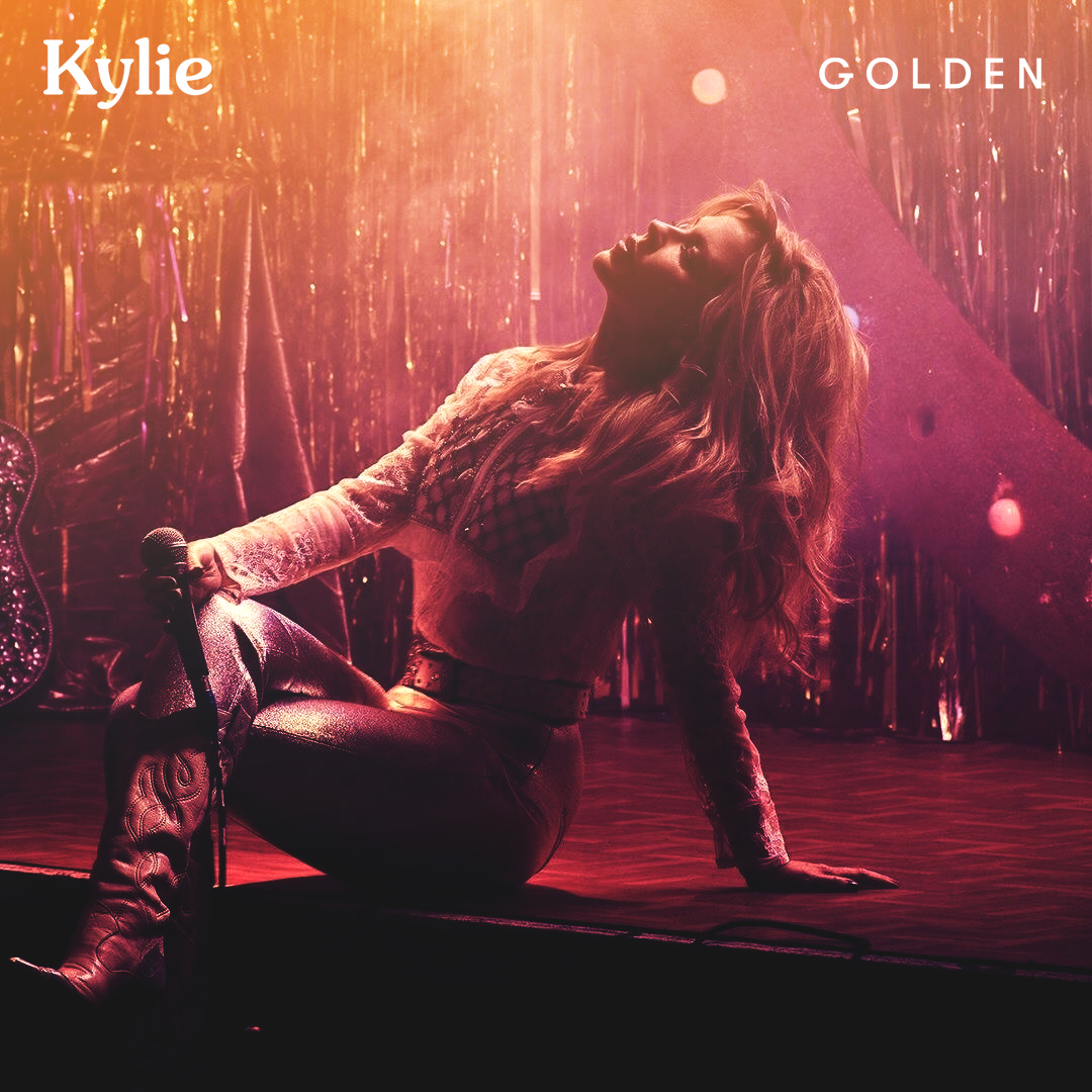
The colouring is fucking ace.
My only suggestion would to move the “Golden” typeset over further to the right to balance it all out. It’s a bit too to the left as it is right now.
I love this colouring, oh my god! So gorgeous. I’d agree that you should move the “Golden” font a little bit closer to the edge so that the distance is equal/the same as the Kylie logo.
Such a beautiful cover, though. 
Thanks SRK, I’ve moved it to the right a bit just for you guys incase any of you wanted to use it

